Saturday, August 27, 2016

Dining room art

The dining room -- really just a lobe of the great room between the kitchen and the office --- doesn't have much wall space at all.  The north wall is a bank of three windows:
 Those are 36" wide and currently open in this picture.

Also check out that horrible chandelier:
Here are all the things wrong with it:

  • It has five arms.  Even numbers are better. Six is ideal. Four is acceptable.
  • Candelabra bulbs.  These are incandescent because the sellers left us a bunch.  Finding proper LEDs for this was annoyingly expensive and difficult, and we had to go with slightly-dimmer IKEA bulbs.
  • The style doesn't match the house.   Well, that's not strictly true.  It matches the bathroom renovation quite nicely.
  • It's ugly. I found exactly this chandelier as an exemplar of ugly lighting choices on Pinterest.
  • Even though the bulbs are glass, there are still windscreens around them and wax catchers under them, so they can be more "convincing" in their fake-candle-ness.
Here are all the things right with it:
  • It turns on with a switch.  Only one switch, and a real one, not a relay.  
  • Also, off with the same switch.
  • It's pretty bright.
  • The height above the table is good, and the diameter for the room is good.
  • It's hung on a sturdy-looking beam between two rafters, so the mount point is probably secure enough to put something else there.
While we're waiting for a new fixture (current front-runner: glowing dodecahedron), here's the art.

West side.  On the far left in the back you can see the lonely print; upper right is the horrible light fixture.  Through the doorway on the right, the kitchen.  You can just see the corner of Fat Cat Capsizing above the salt and pepper on the kitchen table.

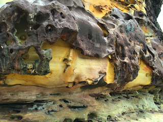
The upper print is volcanic rock flowing over limestone like chocolate sauce over ice cream, from the same beach at Bako as the lonely print.  
The bottom print is from an ice storm in Ann Arbor in the mid '00s, from the brilliant Kate Anderson.  

To the right of these, by the windows, is the beginnings of a group of travel pictures:
 
Top row, from left: baby pit viper at Semenggoh Orangutan Refuge hanging out in the foliage next to the path (credit: Scott Franklin); juvenile bear in the yard of Katie's cabin where I go on writing retreat; Konza prairie again, this time with my then-kindergartener and then-baby.

Bottom row, from left: smoke inversion layer at dawn in the parking lot of MHK, Mt Hood, Super Trees at Singapore Gardens by the Bay.

Eventually these will spread over the whole wall, but I'll need to go to a lot more places first.  Luckily, more travel is very high on my professional goals list. My phone easily prints at 11x14, Target makes simple black 11x14 frames we love, and the world is full of beautiful landscapes adjacent to conferences and universities.

On the other side of the dining room, on the wall it shares with the office, there are three prints in order. 
 
So many things about this delight me:
  • The left is fan art in the style of a WWII poster.  It's WWII Captain America saying "I want you to vaccinate your fucking kids".  I sought the original artist for weeks, was unsuccessful, and made my own print.  This is comics at their finest: history that never was, post-fact romanticized image of what might've been, layered with current events commentary.  I love the overtones of public health as a patriotic act. 
  • The center is a reprint of a WPA poster from the Library on Congress on "Occupations related to mathematics."  The WPA did so many beautiful things for our country, from infrastructure to art.  I spent two weeks cruising a small fraction of the LoC's extensive collection and made five prints. 
  • The right is a copy of the Magna Carta.  This is history that was, but misremembered and made into an icon of something related-but-different.  This print was a graduation gift to my husband from his grandfather, and spent a decade (or more?) rolled up in a tube, waiting for us to have the budget to drymount and space to hang.  It was the first of many things Candlewood framed for us and I love how it came out.
I think this wall is done. 

Thursday, August 25, 2016

Living room art

All these wood walls needed some art.  The previous owner was a painter, and he left us a large number of hooks in random places.  Rather than pull them all out and start fresh, we decided to temporarily hang art using their nails, just to get stuff on the walls.

Turns out they have pretty good nail-hanging taste:
Thats a grouping of four 11x14 travel pictures in the nails on the heat sink.  The corners of the frames are exactly touching.   From the left: Konza Prairie (~10 minutes from the house), Bar Harbor (Maine), Acadia National Park (also Maine), Bako National Park (Borneo).  

From further away:
The clock to the left was my mother's graduation gift to me.  It has numerals in Chinese and the background is a much-faded landscape from a Chinese painting.  The black boxes flanking it are lights:
We put cool white LEDs in the left one and warm white in the right one.  I like the warm better.  When we put in the bulbs, though, these were the primary source of illumination in the living room and we needed the balance from the cools.  We installed more lights, but haven't changed the bulbs.  

Just to the left of the TV, behind the low bookcase and in the micro-hall, there are two prints.  The glowing beehive is one of the new lamps.  It hangs exactly above the coveted corner spot on the couch.  Not very period, but not horribly off and super cheap while I think about something better. 
Here's a closer view of the two prints on the far left:
These are exceptionally difficult to photograph without glare because they face the wall of windows in the sun room.  But, I have an electronic copy of the one on the left,
because I made it myself.  It's inspired by this youtube.  The one on the right is signed by Tom Baker and is one of Matt's most prized possessions.


Looking in the other direction, here's the view from the black chair next to the TV:
 
Some things to notice: 
  • The checkerboard pattern on the wall is because the grain of those panels alternates and catches the light.  It's just like the one on the "Parce que c'est fermee / Docteur Qui" wall.  Those squares are 16" wide.  
  • The wall is super tall.  That's a normal-height doorway in the center back.  The wall is almost 9 squares tall (12 feet).
  • Another one of those black wall lights is installed.  All three are on the same circuit.
  • There are two annoyingly ugly vents.
(Please don't notice the piles of yarn on the dresser or stuff on the leather chair. We live here, we don't like to clean.)

Here's another angle of the grouping on the left.
Clockwise from the glowing thing: lamp, zoo stairs from the extremely talented Josh More, different zoo stairs from Josh (most of his photos are animals in zoos, not stairs at zoos), The Great Wave off Kanagawa, Matt's grandparents standing on a dock when they were our age, and an original painting of waves and pilings from Matt's grandmother.  

On the wall next to these, between the door to the bedrooms and the pantry, is one lonely print:
The print is 3 feet wide, almost 4 with the frame, and the section of wall it is on is 8 feet wide.  Let's marvel for a moment about how my iPhone can take photos that print at 36" wide.  Truly, we are living in the future:
That's the beach at Bako National Park, near the mouth of the Sarawak river, in Borneo. The little figure in the middle is my longtime collaborator, Scott.

I think the wall needs more art, but I don't know what yet and I don't know what I want to do about the vents. 

Tuesday, July 26, 2016

Curtains

We've now owned this house for almost a year.  We're (almost!) done buying furniture and have moved on to decorations.

Check out these dapper foxes!  These are the curtains in the rumpus room and the office.

Do you know how hard it is to take photos of windows?  When it's light out, they're backlit.  When it's dark out, it's dimmer inside.  My camera really can take beautiful photos:
This is a gigantic naked floating toddler in Singapore, for example.  But I digress.

The boy picked this fabric for his curtains:
 
The top border is rainbow stripes.  Rainbow dog feet narrowly edged out rainbow stripes all over, but he was adamant that rainbows be the primary theme.

The girl has slightly more subdued tastes:

 
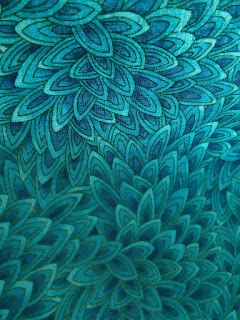
You can't tell, but there's gold edging picking out the feathers (?) or lobes (?) of these flower-like (?) things.  She also got some sheer teal butterflies for the center panel of her room, but there's no way I can get a good picture of that.


In the best tradition of pre-teen girls everywhere, she's sleeping as late as possible and would not stir when I told her it was picture time.   Check out this fantastic art she hung on her door!
 

I'm planning another post with more art details, but not for a couple of weeks -- I have some pieces from my trip to Singapore and Borneo at the framers' right now, and I want to wait until they're up.

Thursday, September 24, 2015

Sun room door

The door from the sun room to the upper patio is not original to the house.  The sun room was enclosed and winterized later, probably in the 1980s.  It might have been a screen porch before then, but I think it's more likely that it was a covered patio.

The door region looks a lot like your standard double sliding glass door.


But it is so much better.

Tuesday, September 22, 2015

Painted room

The painted room is all painted.  The floor is in.  It looks absolutely gorgeous in there.
The light balance is a little off on my phone, but the color is Behr's Tahitian Sky:

The ceiling is still (sorta) white.  It looks a lot beiger now that the walls are beautiful.  Speaking of walls, the new dividing wall between the MBR and the Painted room is complete.  You can just see the top of it in this shot  (or not: look how well it blends in to the rest of the wall).

Monday, September 21, 2015

What kind of plant is this?

The sellers left us a lot of potted plants, mostly outside on the upper patio but also scattered about the lower patio, driveway, and dining room.
Who abandons their plants like this?

Most of them are mysteries to me.  We have a house rule that all plants that come indoors must be non-toxic and hard to kill.  Otherwise they live (and probably die) outside.  So it's pretty important that we figure out what these are and re-home them if they will be problems.

What is this?

Monday, September 14, 2015

Bedroom separation

The master bedroom and the painted bedroom are conjoined.  Some previous owner cut a hole in the wall between them and made a "sitting room" appendage to the MBR.  

We are separating them again.

View from painted room into MBR.

That's 2x6 framing, not 2x4.  Luckily the hole is only 8' high, so we don't need to build a very tall wall.